ggiraph
Make ggplot interactive
ggstance
Horizontal versions of ggplot2 geoms
ggalt
Extra coordinate systems, geoms & stats
ggforce
Accelarating ggplot2
ggrepel
Repel overlapping text labels
ggraph
Plot graph-like data structures
ggpmisc
Miscellaneous extensions to ggplot2
geomnet
Network visualizations in ggplot2
ggExtra
Marginal density plots or histograms
gganimate
Create easy animations with ggplot2
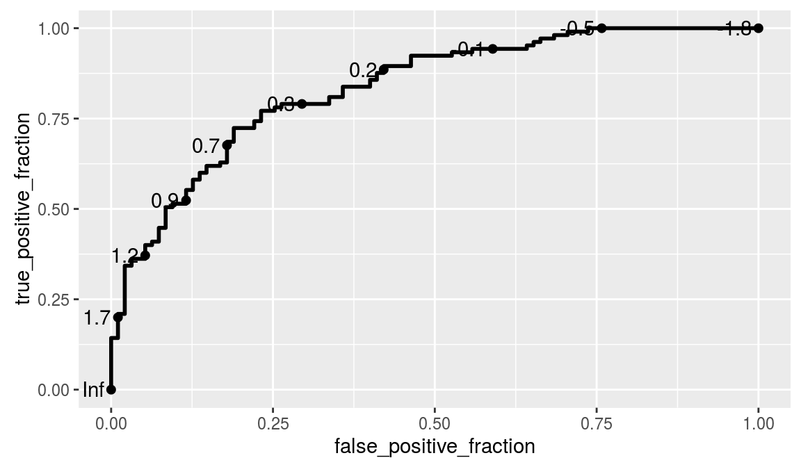
plotROC
Interactive ROC plots
ggthemes
ggplot themes and scales
ggspectra
Extensions for radiation spectra
ggnetwork
Geoms to plot networks with ggplot2
ggtech
ggplot2 tech themes, scales, and geoms
ggradar
radar charts with ggplot2
ggTimeSeries
Time series visualisations
ggtree
A phylogenetic tree viewer
ggseas
Seasonal adjustment on the fly
plotROC
https://github.com/sachsmc/plotROC
Most ROC curve plots obscure the cutoff values and inhibit interpretation and comparison of multiple curves. This attempts to address those shortcomings by providing plotting and interactive tools. Functions are provided to generate an interactive ROC curve plot for web use, and print versions
# Example from http://sachsmc.github.io/plotROC/
library(ggplot2)
library(plotROC)

# I start by creating an example data set. There are 2 markers,
# one that is moderately predictive and one that is not as predictive.

set.seed(2529)
D.ex <- rbinom(200, size = 1, prob = .5)
M1 <- rnorm(200, mean = D.ex, sd = .65)
M2 <- rnorm(200, mean = D.ex, sd = 1.5)

test <- data.frame(D = D.ex, D.str = c("Healthy", "Ill")[D.ex + 1],
                   M1 = M1, M2 = M2, stringsAsFactors = FALSE)

# The Roc Geom
# Next I use the ggplot function to define the aesthetics, and
# the geom_roc function to add an ROC curve layer.

basicplot <- ggplot(test, aes(d = D, m = M1)) + geom_roc()
basicplot